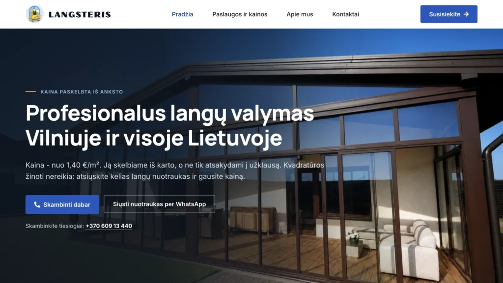
Most small service businesses in Lithuania start the same way: enquiries arrive through a classifieds portal, quotes go out as Word documents, and there is no website of their own, because “we don’t need one yet”. That is exactly how Langsteris worked - a window cleaning company based in Vilnius, working across Lithuania.
This post is about what we did when we built its website and, more importantly, why. Not about design trends - about decisions any service business can copy.
Where we started
Mantas Narkevičius has been cleaning windows for four years. Before that he worked for cleaning companies; now he works for himself, based in Vilnius and taking jobs across the country. His rating on the portal was 4.7 out of 5 from five reviews. What he lacked was not quality but a channel of his own: every customer came through a middleman, and the quote arrived looking like a Word document with no mark on it.
Before the website we built the brand - a logo, a colour palette, a visual language, printed advertising and a paper loyalty card. According to the owner, once the printed advertising went out, calls went from roughly 1-4 a week to 2-4 a day.
We will say it plainly: that is the result of the printed advertising, not the website. The site launched recently and there is no traffic data yet. We come back to this at the end.
The real tension is not “modern or dated”
A window cleaning customer is usually someone about to let a stranger into their home. They are not comparing website design. They are trying to work out three things: what it will cost, who will turn up, and whether there will be problems.
The typical site in this trade in Lithuania looks dated, but it gets one thing right: it is plain and understandable. The typical “modern” site often does the opposite - big photography, few specifics, the price hidden behind a “get in touch” button, no phone number, a form in its place.
The customer is not afraid of a modern website. They are afraid of not knowing.
So the real tension is not between modern and dated, but between impression and clarity. The decision we made: let typography, spacing and order carry the premium feel, and let specifics carry the trust. The site is visually restrained; the information on it is openly stated.
Eleven decisions that build trust
- The price is published up front. “From €1.40/m²” on the first screen, and every rate on the services and prices page. Most competitors write “contact us for a price”. A price on the page is the strongest trust signal on the whole site.
- The main obstacle to enquiring is removed. Customers almost never know their square metreage. So the site says: you don’t need to know it, send a few photographs of your windows and you will get a price. That is how the work is actually done - it is simply written down.
- A face and a name. A section called “Who will come to your home”, with the owner’s photograph and a short history. Not for decoration - because the real doubt is “who am I letting into my flat”.
- What is not included, written out honestly. What window cleaning covers and what it does not. No detailing-level promises, no pressure washing, no spraying for spiders. What others leave unsaid is written here.
- Real reviews, including the ones that are not five stars. The page says it plainly: every review is published. One of them criticises the frames after a post-construction clean - it has been left in.
- The awkward terms are written down rather than hidden. A €30 minimum order, travel charged, VAT added on invoices, weekends more expensive. Not one of these was dropped from the mobile version.
- Duration with a concrete example. An 80 m² flat with 11 windows - about two hours. People want to know not only the price but how long somebody will be in their home.
- You can phone. The number and WhatsApp are visible immediately; the form is an alternative, not the only gate. An older customer rings, a younger one writes. Both have to find their own way.
- A restrained visual system. Flat brand colours, 4px corners, hairlines instead of shadows, one accent taken from the logo. Manrope for headings, Inter for text.
- Animation, but only enough not to notice it. Content appears gently as you scroll. Nothing that asks for attention.
- The mobile version is a lighter desktop version, not a different site. The same sections, less text, tighter spacing. We shortened navigational and repeated sentences - not the terms and not the prices.
What we deliberately did not do
Design write-ups rarely say what was left out. And that is usually what separates a site you can trust from one trying to look bigger than it is.
- No invented reviews, ratings, “500+ happy customers”, certificates, awards or guarantees.
- No “best in Vilnius”, or any other claim nobody can check.
- No generic stock photography. Every photograph is real work.
- No purple gradients, glowing blobs, glass effects, 3D objects or animated counters.
- We did not write that the company is large - and we did not write that it is one person either. The number of staff is never mentioned, because it is not the customer’s question.
Speed: what we actually cut
Speed in a service business is not a technical pastime. Somebody looking for a window cleaner on their phone, standing at the window, has no patience for three seconds.
| Measure | Before | After |
|---|---|---|
| Hero photograph on mobile | 369 KB | 61 KB |
| CSS per page | 493 KB | 245 KB |
| Page builder add-on CSS | 359 KB | 45 KB |
| Space on the server | 382 MB | 299 MB |
| Number of files | 21 300 | 15 850 |
| Home page height on mobile | 5682 px | ~4470 px |
| External font requests | 2 | 0 |
Most of that CSS came from a page builder add-on loading the styles for all of its widgets on every page, although the site uses three of them. The fonts moved onto our own server, which removed two external requests. Cached pages are served in 17-26 ms.
One detail worth telling: we had started building our own WebP conversion, and then saw that the server’s CDN already did it. We cancelled the work and deleted the files. Checking before building sometimes saves more than any optimisation.
SEO and visibility in AI assistants
A small business rarely takes first place from the big portals. It can win where the portals are weak: on longer, specific queries, and in the map block.
- Titles and descriptions for every page, in Lithuanian. Alt text, form fields and error messages too.
- Structured data: organisation, local business, a service catalogue with the real prices, the rating and the reviews. Prices in the schema mean that search engines and AI assistants both read them.
- The rating in the schema matches exactly what a visitor sees. We never publish what is not on the page.
- An llms.txt with a factual description of the business, and a robots.txt that plainly admits 18 named AI crawlers. Visibility in AI assistants was a deliberate second priority.
- A Google Business Profile created and matched to the data on the site. The sitemap submitted to Search Console.
We deliberately did not publish coordinates. Langsteris travels to the customer, so a map pin would essentially be the owner’s home address. It would do very little for rankings and would publish that address permanently. Not every SEO recommendation is worth following blindly.
One technical thing that cost time: the sitemap returned a 404 at first. That happens when the home page is static. We only found it because we checked the real request rather than the plugin’s settings screen. The general lesson: check it live, not by whether the settings look right.
What we cannot claim yet
The site launched recently. So we are not saying that it brought customers, enquiries or rankings - that data does not exist yet. No conversion percentages, no “first in search”.
We can state only what has been measured: the site works, it is fast and technically tidy, and its prices, terms and limits are published in the open. In a few months there will be Search Console and Google Profile data - and then we will write a second part with real numbers.
What to take from this for your own business
If you run a service business and are thinking about a website, five things from this project apply to almost everyone:
- Write the price, at least a “from”. Design that hides the price looks more expensive. Just not in the way you would want.
- Remove the main obstacle to enquiring. Work out what the customer does not know, and therefore does not write. Then let them write without it.
- Show the person. If you go into somebody’s home or business, a face and a name matter more than any design decision.
- Write down what is not included. A limit stated in advance is not a drawback - it is a trust signal.
- Four pages is enough. The Langsteris site has Home, Services and prices, About us and Contacts. Twelve pages would not mean more content - only more places to forget to update it.
You can see the whole site at langsteris.lt, and a fuller description of the project with screenshots in the Langsteris case study.